Everyday Pebblefish publishes an inspiration board for the Pantone Colour Of The Day……yep that is an actual thing. Go on, check it out for yourself here.
Sometimes the colours are a joy, sometimes not so great, others simply inexplicable. We don’t get to choose them, however we do accept the challenge.
We try to make the content on these boards truly different, whether it be by event type, décor, food, fashion, flowers, lighting, venue……you get the picture.
However our main inspiration in putting these boards together, is to inspire you.
We publish on our social media channels every day, so please follow, like, get in touch and let us know what you think.
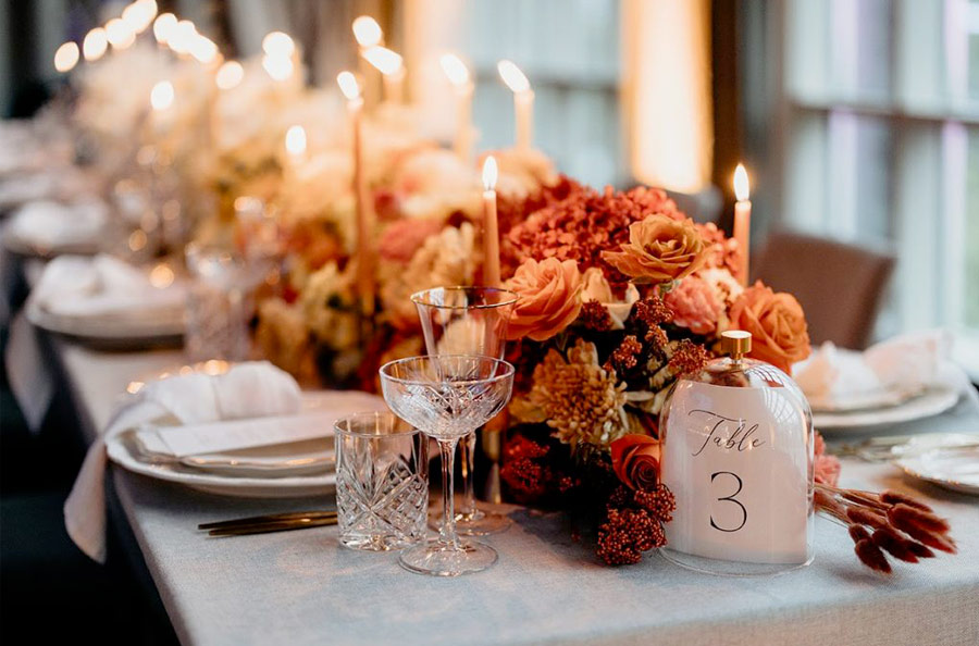
January 18th – Pantone 17-1614 Deco Rose
[su_row class=””]
[su_column size=”1/2″ center=”no” class=””]
Colour palettes develop in a whole range of ways….favourite colours, theme appropriate, venue aesthetics, on trend, seasonal, what’s available…….
I am pro some and very much anti with others, but hey, it’s what you want, so that is where we start.
For anyone who has read more than one of these blogs, you may have noticed that we would normally advise shying away from multiple bold colours taking centre stage.
We stand by this…..it can get messy……overpowering…..and the look can date quickly, however with proper care, it is possible to mix strong colours in a complementary and aesthetically stunning manner.
[/su_column]
[su_column size=”1/2″ center=”no” class=””] [/su_column]
[/su_row]
Deco Rose is a beautiful, feminine colour with a hint of antique and dare we say stuffiness?
The temptation could be to vintage this up……really stamp a time and date on this…..and it would look awesome. It’s a gorgeous colour and come on, vintage is always “in”.
But in colour-blocking this delicate rose variant with a bold, masculine, almost navy blue, we’re bang up to date with a more modern, cosmopolitan take on a classic. Avoid the need to constantly mix the colours together. Allow them to stand side-by side, only frequently permit them to mingle. Too much, then it all becomes a little too contrived.
However, don’t forget to highlight. A soft gold or an off-off white will allow the bolder colours to relax, at times, just for a minute, stealing centre-stage.
Enjoy.